


In-app Customer Outreach
FOCUS
UX/UI
ROLE
SOLE DESIGNER
PLATFORM
NATIVE APPS
TIMELINE
MAR 2025—APR 2025
We needed a better way to hear directly from our app users. Feedback was limited and scattered across different tools, making it hard to understand how people were experiencing the product or which problems were worth solving. This project focused on creating a lightweight and clearer path for users to share their thoughts, helping the team stay closer to real customer needs and make more informed decisions.
Defining Success
THE CHALLENGE
NOTHS had almost no direct line to customers inside the app. Feedback mainly came through fragmented channels, such as Trustpilot reviews or customer support, which revealed issues but rarely the underlying reasons. As a product team, we weren’t speaking to customers regularly enough to understand their jobs-to-be-done, mindset, or pain points. Without a structured pipeline for feedback and interviews, we risked making product decisions in the dark. The urgency was clear: we needed to start building this relationship immediately to identify the most significant problems worth solving and track the app's health over time.
MY APPROACH
A framework for in-app outreach was defined by mapping potential touchpoints against the customer journey. Lightweight UI patterns — banners, modals, and sheets — were designed to flex depending on the type and urgency of the request. The guiding principles were clarity, trust, and minimal friction: customers needed to instantly understand why they were being asked and what would happen next.
Three outreach channels were prioritised:
- Surveys: short, ad-hoc checks on app health or specific features.
- Interview recruitment: invitations placed at relevant moments (e.g., post-order, post-delivery).
- Persistent feedback tools: a refreshed “App Feedback” section in the menu for ongoing input.
THE SOLUTION
The result was a flexible in-app outreach framework that introduced:
- Post-order and post-delivery prompts to capture timely reactions and invite customers to interviews.
- An updated feedback module in the app’s menu for continuous input.
- Consistent outreach patterns that balanced visibility with subtlety, integrating requests seamlessly into the product experience.
Success was measured by how many users signed up for interviews or completed surveys, with the larger goal of keeping customer voices central to product decision-making.

Implementation
PLACING FEEDBACK WHERE IT MATTERS
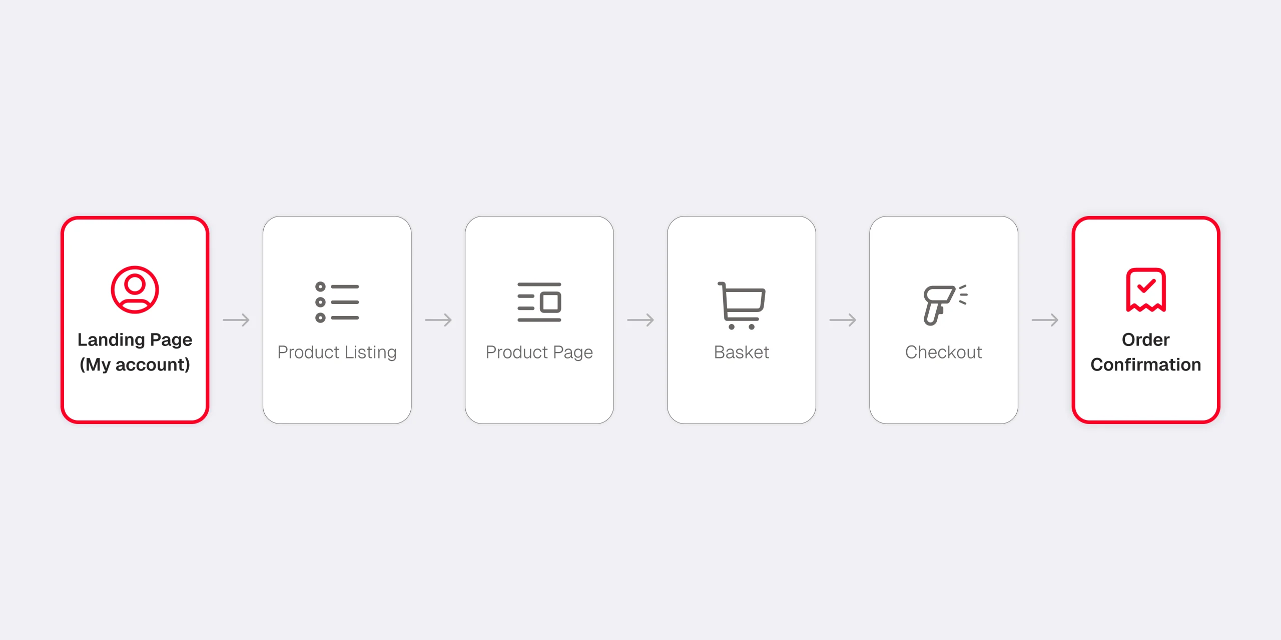
The rollout began with two natural points in the user journey: the My Account section and the Order Confirmation screen.
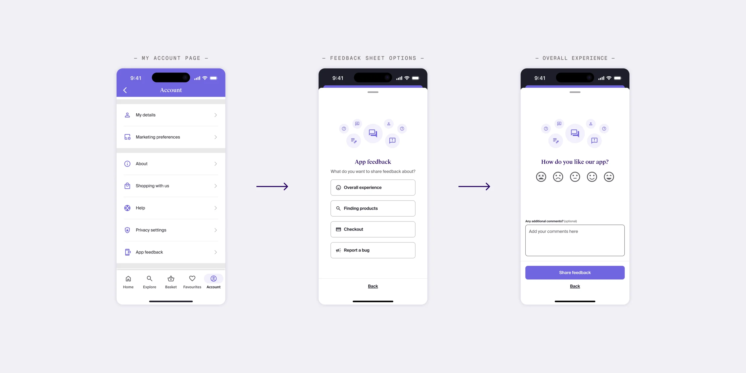
- In the account area, a new entry was introduced so users could leave feedback about the app at any time, a persistent, low-friction way to share thoughts on their own terms.
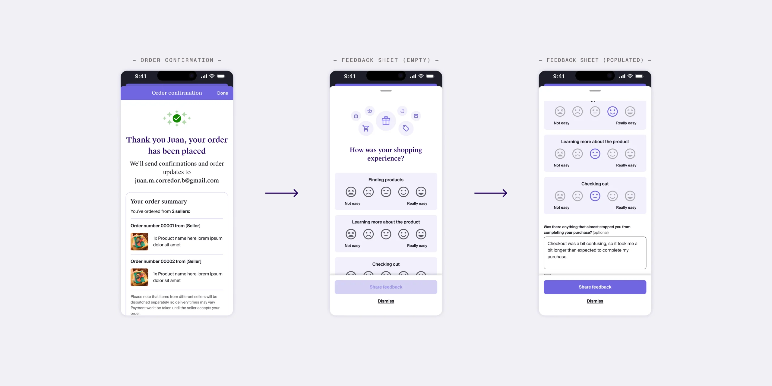
- On the confirmation screen, shown immediately after a purchase, a lightweight prompt was added to capture fresh impressions and invite users to opt into a follow-up interview.
These touchpoints were chosen for their balance of visibility and respect for the shopping flow: close enough to moments of real experience, but not disruptive to the purchase itself.
A PERSISTENT CHANNEL FOR FEEDBACK
A dedicated “App Feedback” entry was introduced in the user’s Account menu, giving customers a consistent place to leave comments about their experience.
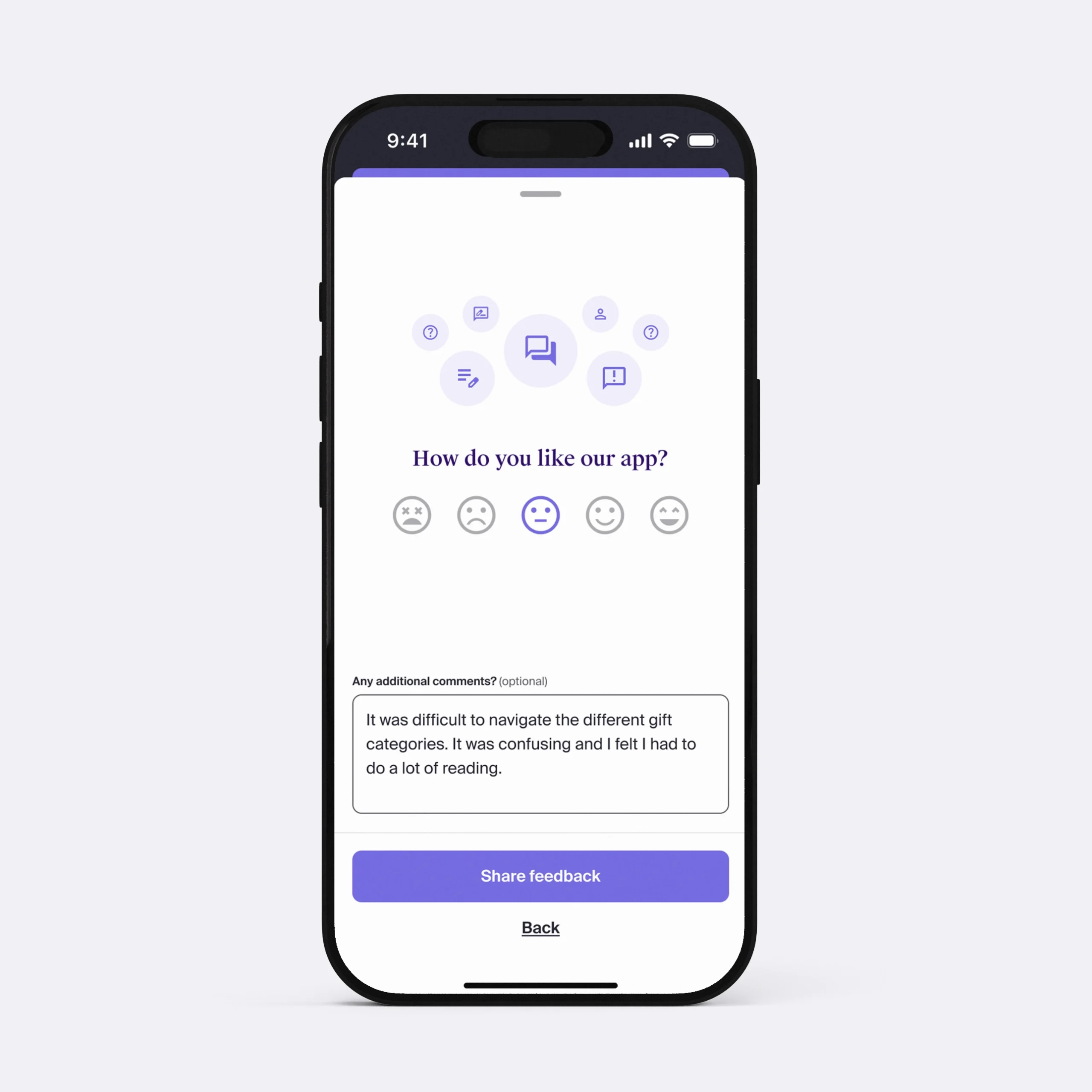
When selected, users could choose the type of feedback they wanted to share, from overall satisfaction and ease of finding products, to checkout issues or reporting a bug. An open text field remained available for unstructured input.
This structure created a balance between categorised insights, which could be routed more effectively, and open-ended comments, which preserved the customer’s own voice.
CAPTURING FEEDBACK AT THE POINT OF PURCHASE
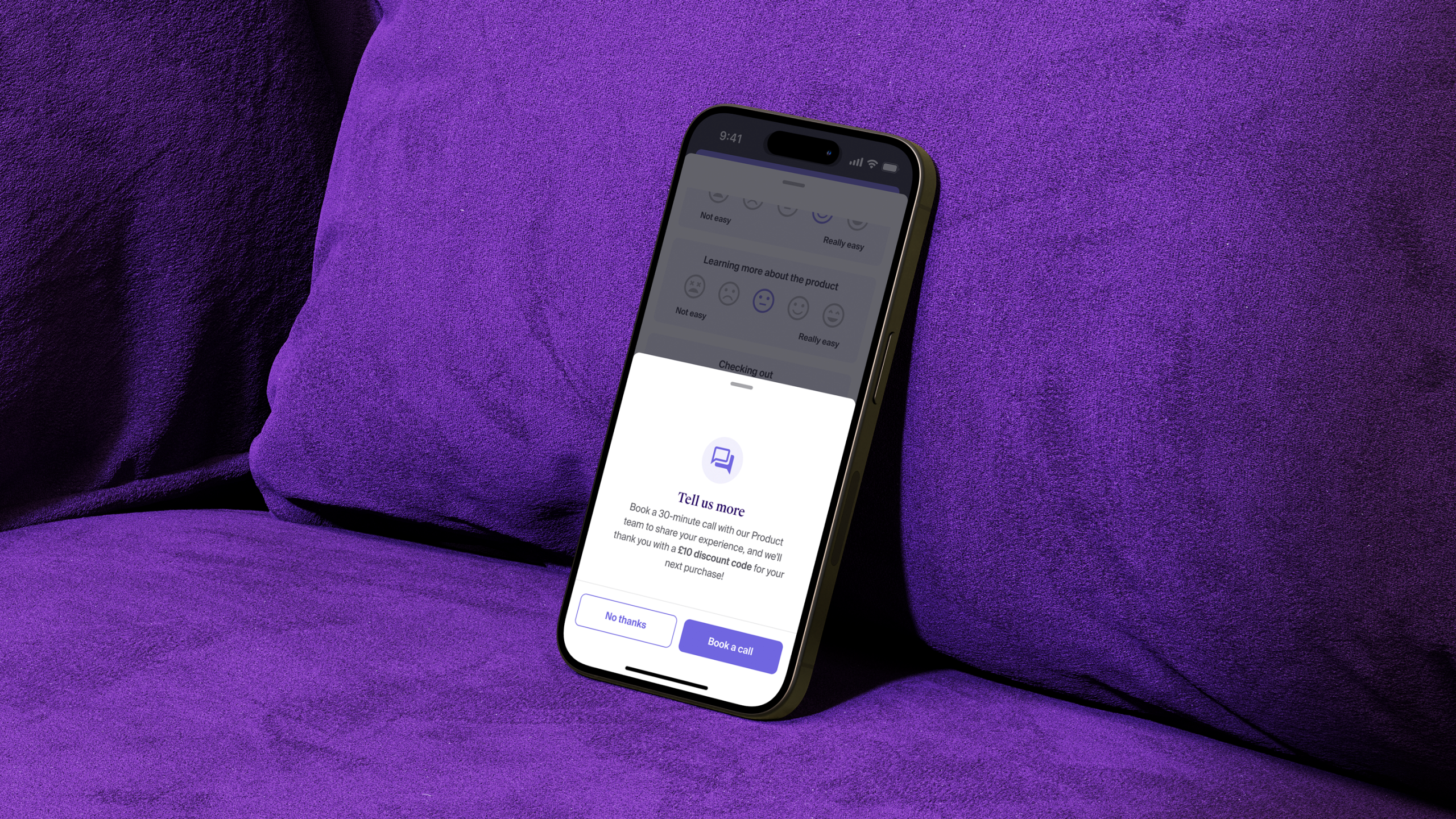
The Order Confirmation screen was adapted with a lightweight prompt that appeared immediately after checkout. This allowed customers to share quick impressions while the shopping experience was still fresh.
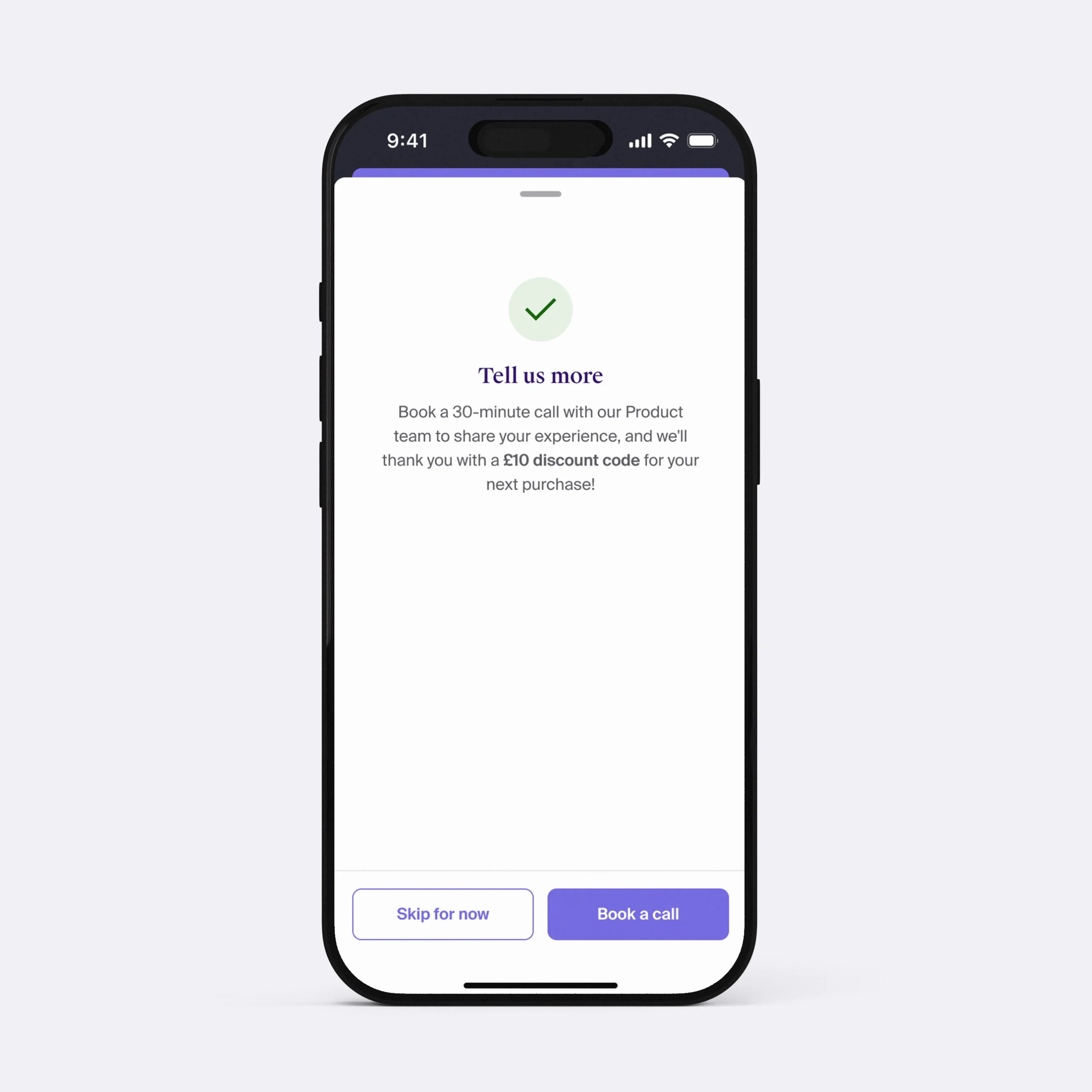
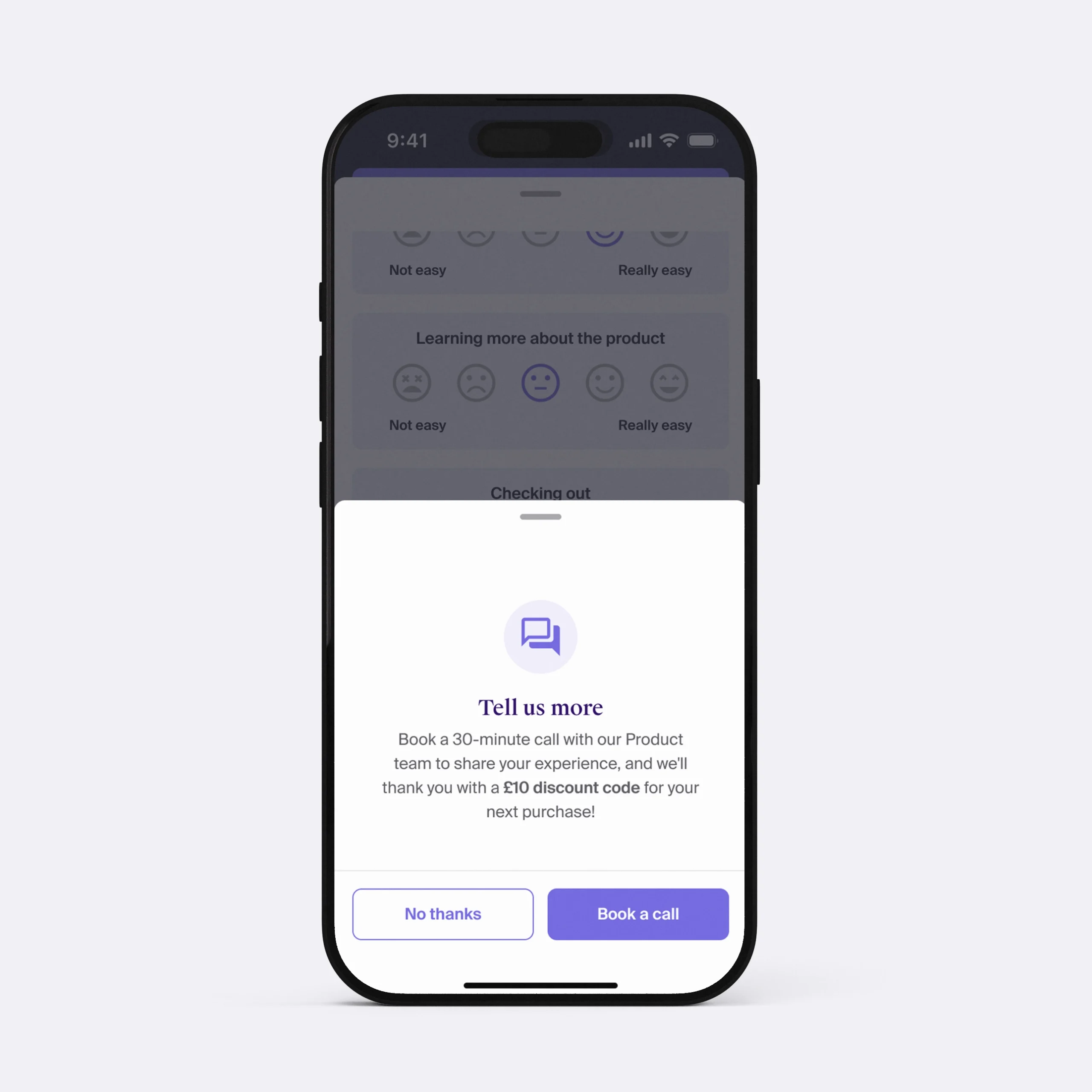
From there, they could choose to provide short feedback or opt into a follow-up interview, incentivised with a small reward such as a discount code. This ensured outreach felt like an opportunity, not an interruption.
POST-DELIVERY TOUCHPOINTS
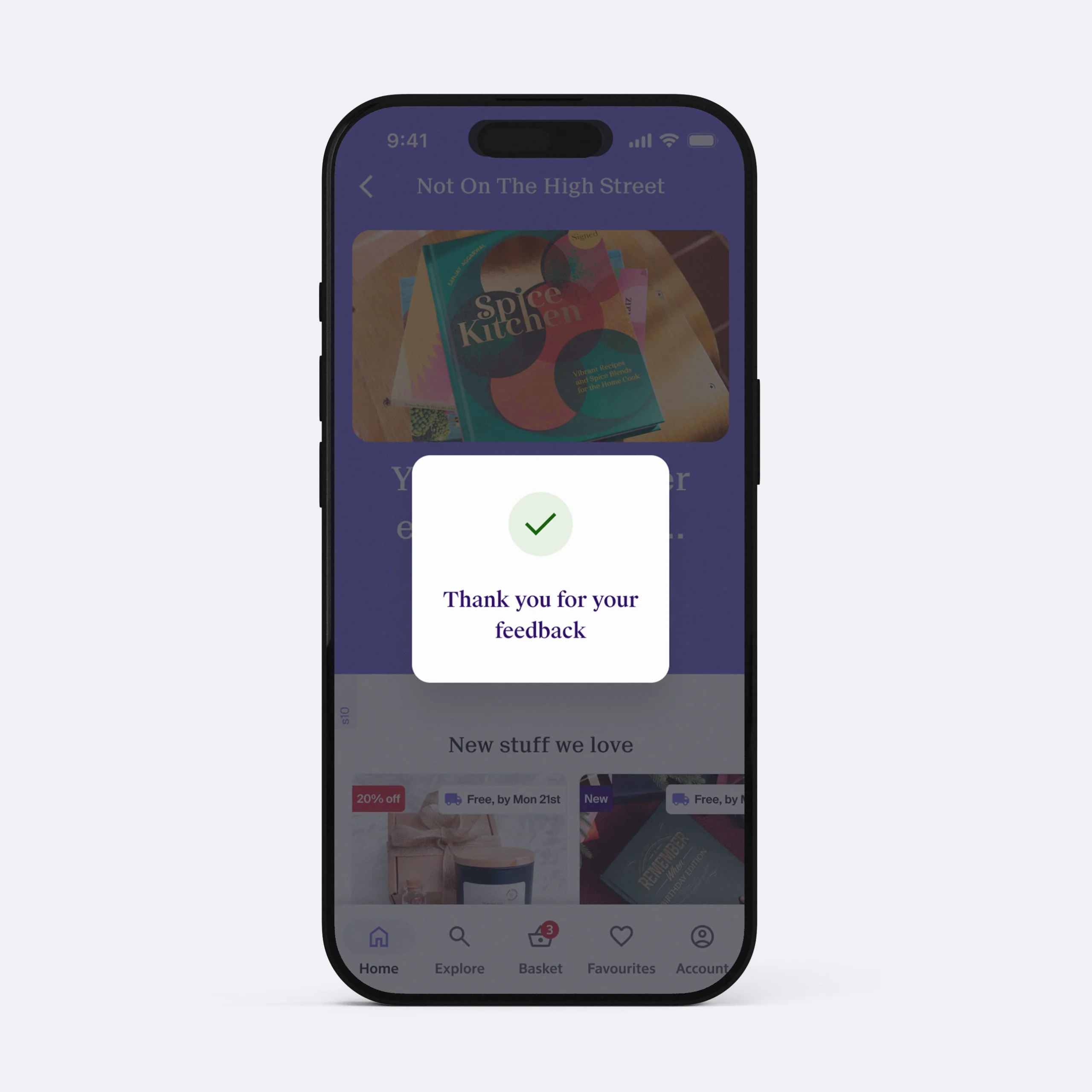
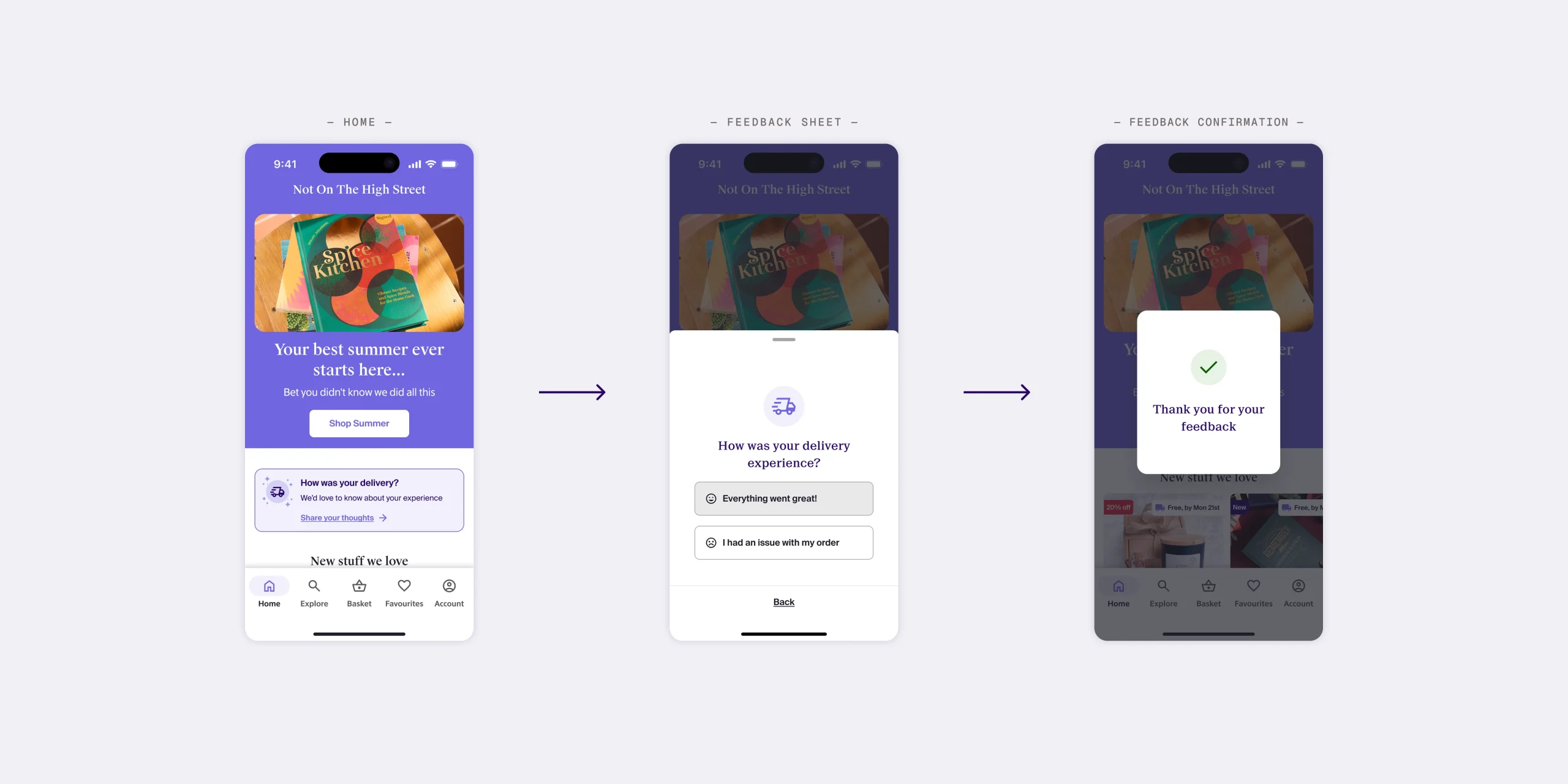
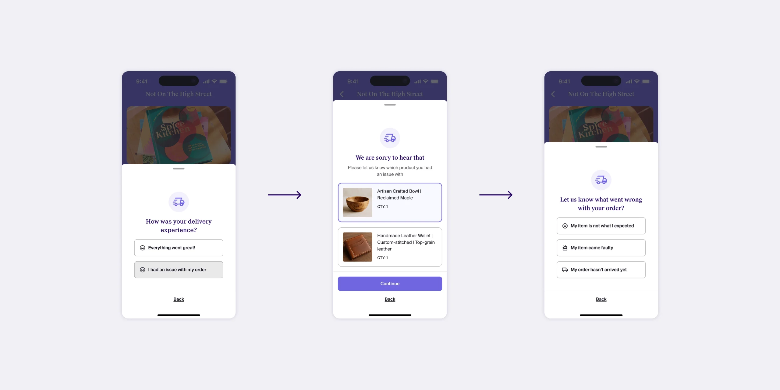
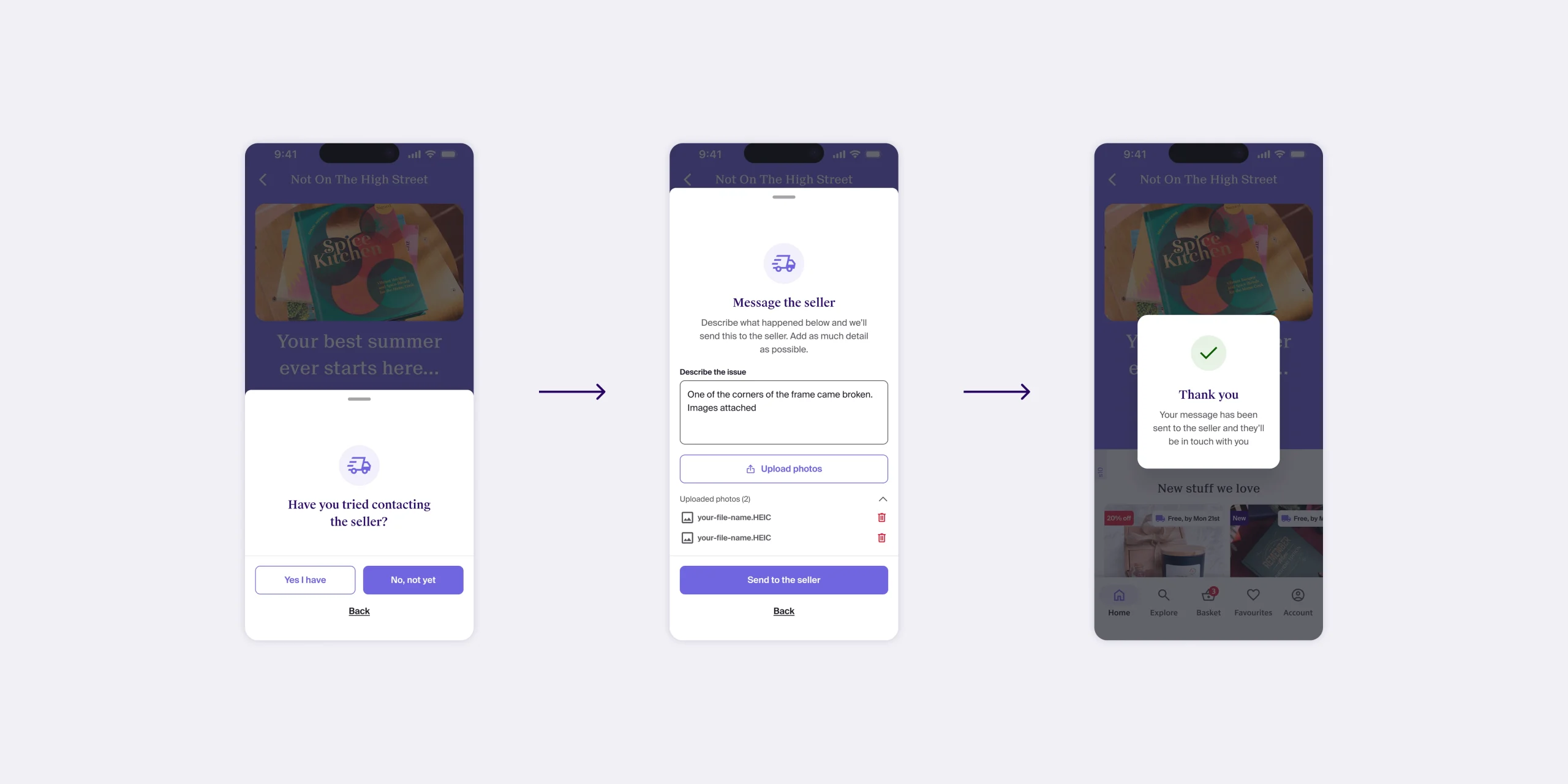
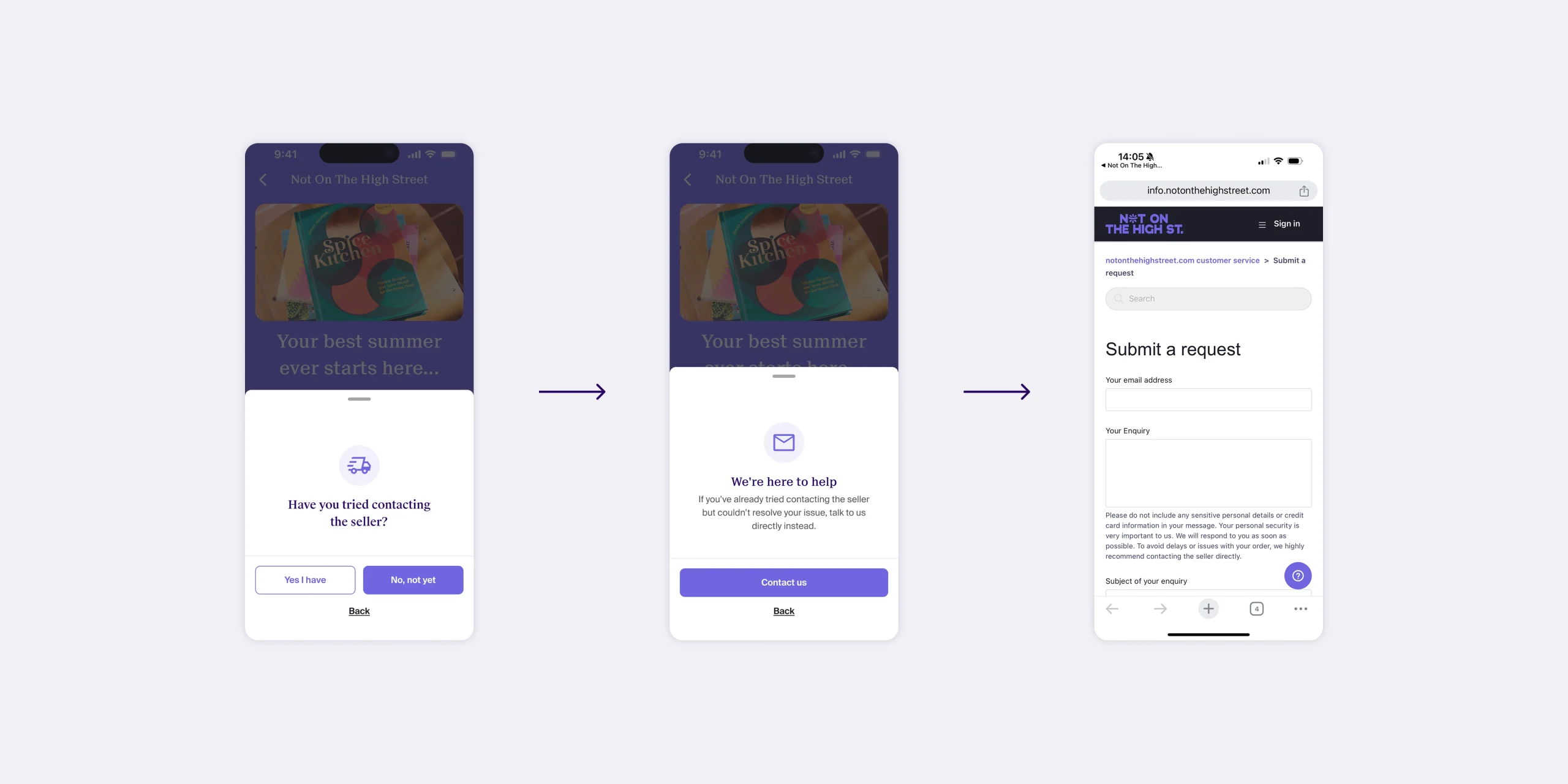
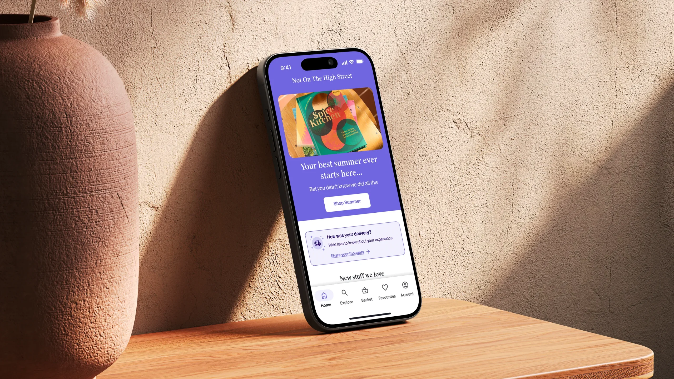
A second layer of prompts was introduced after delivery, when customers had received and interacted with their order. These appeared as modal sheets, asking users about the quality of the experience and offering the chance to join an interview if they wanted to share more.
By engaging customers both immediately after purchase and post-delivery, the framework captured feedback across two key moments: initial impressions and actual product experience.
DRIVING FEEDBACK AND REPEAT APP USE
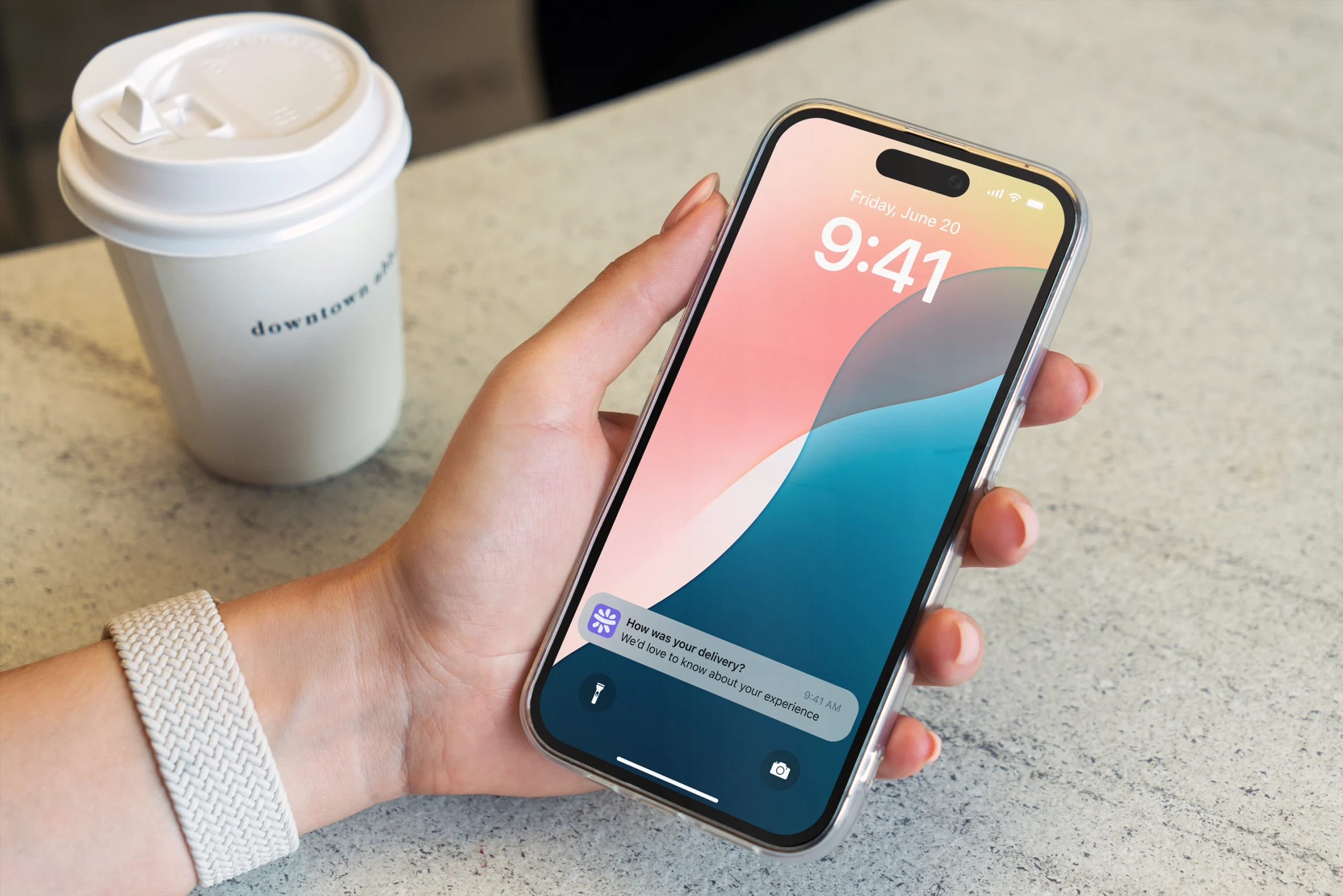
Push notifications were used sparingly, not only to invite customers to leave feedback but also to reinforce the app as the best place to stay up to date. For example, customers who had recently placed an order could receive a prompt to share their experience, while also being reminded that the latest order status and delivery updates were always accessible through the app.
This mechanism worked on two levels: it encouraged participation in feedback initiatives while simultaneously nudging users to return to the app more often, highlighting its role as the primary touchpoint over the website.
CONTACT ↴
©2026