

Onboarding Prompts
FOCUS
UX/UI
ROLE
SOLE DESIGNER
PLATFORM
NATIVE APPS
TIMELINE
JAN 2025—FEB 2025
When new users first opened the app, they were presented with a series of mandatory prompts (e.g., Terms & Conditions, tracking, and notifications) out of context and in an unclear order. It felt fragmented and uninviting. This project transformed that experience into a single, coherent flow that explains why each prompt matters. The goal was to build trust from the start, encourage more opt-ins, and make the app’s first moments feel smooth and welcoming.
Framing the Problem
THE CHALLENGE
New users were greeted by a sequence of disconnected permission prompts — tracking, notifications, and terms — shown without context or logic. It felt transactional, not welcoming. Success for this project meant creating a smoother, more transparent onboarding experience that users could trust.
MY APPROACH
I focused on improving clarity and timing. Each prompt was rewritten and reordered to communicate why it mattered, not just what was being asked. The flow was redesigned to feel human and considerate — reducing confusion, encouraging opt-ins, and respecting user choice through contextual reminders later in the journey.
THE SOLUTION
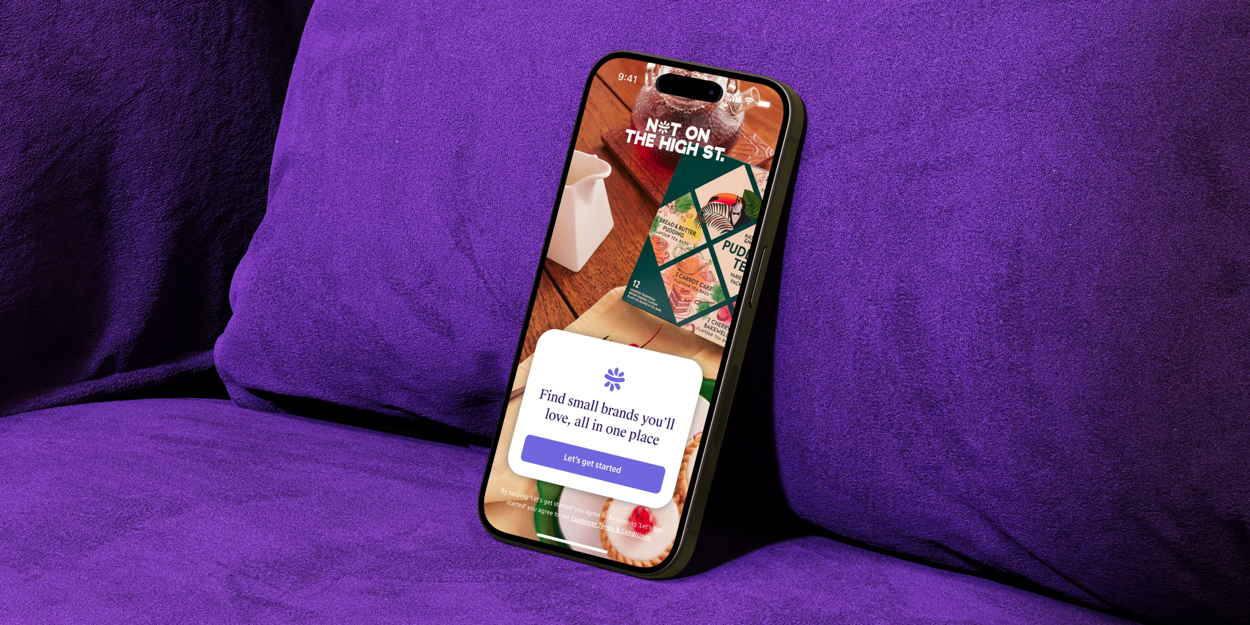
We refreshed the onboarding visuals and rethought the sequencing from the ground up. The new flow opens with a more vibrant splash screen, designed to capture attention and reflect the creativity of the small independent brands behind NOTHS. Every subsequent screen was crafted to build trust and guide users naturally through their first interaction with the app.

EXPLAINING BEFORE ASKING
To increase notification opt-ins, we introduced a context screen that explained why turning them on mattered before showing the system prompt. Instead of asking for permission upfront, users first saw clear examples of the benefits: discovering deals, contacting sellers, and receiving order updates.
Each benefit was paired with a friendly illustration that rotated in a gentle animation, giving users time to absorb each message. This small shift turned a compliance step into a moment of value and trust, helping users understand how notifications could genuinely improve their experience with the app.

DESIGN FOR TRANSPARENCY
We approached the tracking prompt with the same goal: to make it feel transparent, respectful, and unobtrusive. Instead of presenting it as a compliance step, we framed it as an opportunity for users to help improve the app experience.
The screen explained, in simple language, how tracking data helps us create more relevant and engaging content, while clearly reassuring users that their data is never sold. Soft visuals and a friendly tone reinforced a sense of trust, turning a sensitive topic into a positive, cooperative moment.

SOFT REMINDERS
For users who hadn’t yet enabled notifications, we introduced a passive reminder within the My Account section, a subtle nudge rather than an interruption. The message reinforced the benefits of notifications in a calm, contextual way, allowing users to take action when it suited them.
If they still preferred not to proceed, the banner could be easily dismissed. This approach balanced user autonomy with strategic encouragement, offering a final, respectful opportunity to enable notifications once they were more familiar with the app.

CONTEXTUAL PROMPTS AT THE RIGHT MOMENT
Not every user enables notifications during onboarding, so we designed contextual prompts to re-engage them later in their journey. These appear after meaningful actions, such as messaging a seller or completing an order, gently reminding users how notifications improve those moments, facilitating communication between the parties.
Each screen uses a helpful tone and relevant illustrations to make the benefit clear without interrupting the experience. To support both iOS and Android, the visuals were adapted to each system’s interface, ensuring instructions felt familiar, accurate, and trustworthy across platforms.


REINFORCING VALUE AFTER SIGN-IN
These prompts were designed to appear after the user had signed in, not during onboarding. While visually consistent with the initial flow, the messaging was reframed for a different moment — when users had already explored the app but hadn’t yet enabled notifications.
At this stage, the copy focuses on practical benefits users can now relate to, such as receiving enquiry updates or order tracking alerts. By surfacing these prompts later, we encouraged users to reconsider their choices with clearer context and demonstrated value, maintaining visual continuity while deepening relevance.

IMPROVING THE TERMS & CONDITIONS SCREENS
We also redesigned the layout and hierarchy of the Terms & Conditions and tracking policy screens. The original content was dense and intimidating, so we refined the structure through better spacing, clearer typography, and improved sectioning to make it more scannable and approachable.


CONTACT ↴
©2026