
Confluent Hub
FOCUS
UX/UI, INFORMATION ARCHITECTURE
ROLE
SOLE DESIGNER
PLATFORM
WEB
TIMELINE
AUG 2018—SEP 2018
Confluent Hub was the company’s first step in centralising its growing connector ecosystem into a public marketplace. For developers, it meant a faster way to discover and install pre-built connectors to integrate Kafka with tools like MongoDB, AWS S3, Elasticsearch, and Snowflake.
We built the foundations of a platform that became relevant to the Kafka developer experience, while also shaping a vision for how it could evolve into a trusted, enterprise-grade marketplace.
Framing the Problem
THE CHALLENGE
Before Confluent Hub, connectors were scattered across documentation, GitHub repos, and partner sites. Developers struggled to discover, compare, and install the right connector for their use case. This slowed adoption and weakened Confluent’s positioning as the home of Kafka connectors.
MY APROACH
I focused on designing an MVP that made discovery and installation straightforward while laying the groundwork for scalability. For the first release, we prioritised:
For the first release, we prioritised:
- A searchable catalogue where all connectors could be found in one place.
- Clear installation paths via the Confluent Hub CLI.
- Consistent connector detail pages that explained what each connector did and how to use it.
SOLUTIONS
The first release of Confluent Hub centralised over 250 connectors into a single open marketplace. For developers, it meant one destination to find and install pre-built connectors. For Confluent, it created a new distribution channel and laid the foundations for a strategic marketplace, one that we could later evolve into a trusted, enterprise-grade platform.
Success for the first iteration meant delivering on three objectives:


Background
WHAT ARE KAFKA CONNECTORS?
Kafka connectors are pre-built integrations that enable data to flow seamlessly between Apache Kafka and external systems, such as databases, cloud applications, search engines, or data warehouses. Instead of building custom pipelines from scratch, developers can use connectors to stream data in and out of Kafka quickly, reliably, and at scale.
There are two main types:
- Source connectors bring data into Kafka from external systems.
- Sink connectors push data out of Kafka into target destinations.
Together, they form the background of many data infrastructures.

Implementation
LAYING THE FOUNDATIONS
With a lean team and tight timelines, we focused on the essentials that would deliver the most value early: search, scannability, and trust signals.
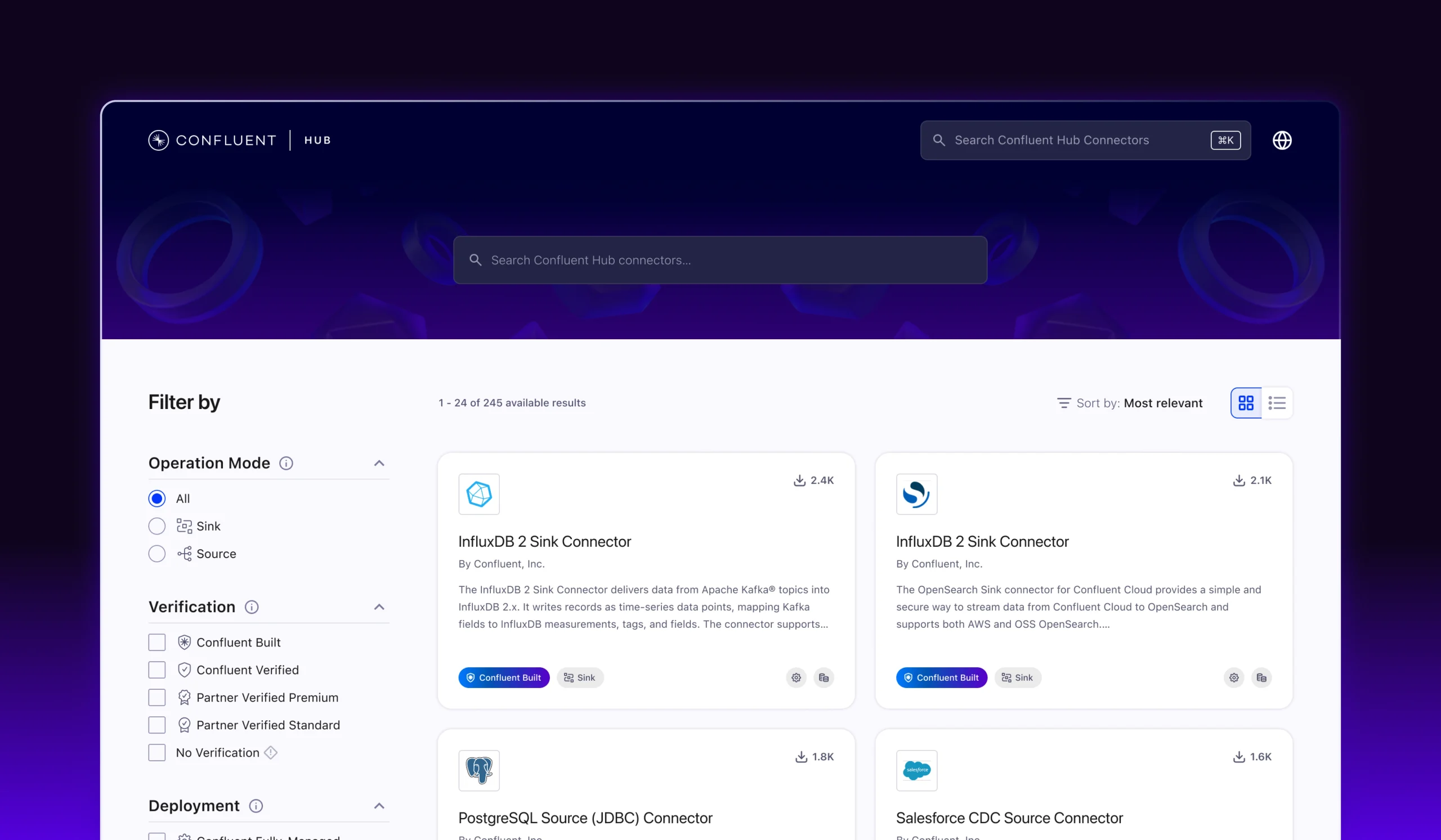
At the top of the experience, we placed search front and centre. This directly addressed the biggest pain point: developers struggling to locate connectors across fragmented sources. The MVP paired this dedicated search bar with a simple catalogue landing page, giving users a clear and reliable starting point for exploration.

CONNECTOR CARDS: EVALUATION AT A GLANCE
Connector cards became the core building block of the catalogue, designed to help developers quickly evaluate options without scanning through dense details.
Each card surfaced only the essentials:
- Name and type
- Short description of purpose
- Logo for fast visual recognition
- Key metadata: verification, license, support, author, version


REFINING RESULTS TRHOUGH SEARCH
At launch, Confluent Hub included a broad set of filters to help developers cut through the noise. The MVP exposed multiple dimensions, from operation mode and component type to deployment, verification, support, and license.
Developers coming from scattered repos needed confidence that they could narrow results to fit their technical, operational, and compliance requirements. Later iterations refined and simplified the filters, but in the MVP stage, the variety helped establish trust and usability from day one.

CONNECTOR DETAIL PAGES
The dedicated connector page gave developers a single, reliable source of truth for each integration. Instead of chasing scattered GitHub READMEs or vendor docs, users could now evaluate a connector in one place.
Each page included:
- Name, logo, and type (source or sink) for instant recognition.
- Description outlining what the connector does and its supported use cases.
- Key metadata such as version, license, author, and verification status.
- Deployment options with clear instructions and downloads.
This structure balanced detail with usability. The goal wasn’t to explain every configuration option, but to reduce friction in evaluation and provide enough confidence for developers to take the next step.


Outcome
ADOPTION AND IMPACT
The first version of Confluent Hub launched with over 100 connectors, consolidating components that were previously scattered across GitHub repos and partner sites. For the first time, developers had a single entry point to discover, evaluate, and install Kafka connectors.
In the six months following launch, Confluent Hub quickly became the go-to destination for discovering and installing connectors. Despite being a lean MVP, usage and engagement showed strong signs of early product–market fit:


Vision & Future
REFLECTION
Looking back after several years, I often felt there was more I could have done. As a personal challenge, I decided to revisit the project and design a realistic set of improvements, applying what I’ve learned since the MVP to imagine how Confluent Hub could evolve into a more complete and trusted marketplace.
MY APROACH
I set out to address the gaps in how connectors could be explored and understood in context, while also modernising the UI. This meant not only improving existing components, but also aligning the experience more closely with Confluent’s evolved brand.
Rather than adding complexity, I focused on creating layers of clarity:
- Introduced categories and use-case collections to guide discovery.
- Optimised metadata for faster scanning and comparison.
- Simplified and consolidated filters to remove redundancies.
- Updated the visual system to reflect Confluent’s brand and strengthen trust.
The redesigned Confluent Hub had the vision to transform the MVP into a more complete marketplace, not just a catalogue, but a destination for discovery, trust, and education.
REDESIGN
In the vision work, I restructured Confluent Hub into three complementary experiences, each serving a different user need.
- A dedicated landing page for exploration: highlighting categories, use-case collections, and educational content to help users discover connectors in context.
- A redesigned search and browse page: focused on speed and precision, with simplified filters, improved metadata, and options for both card and list views.
- A standalone marketing page: positioning Hub as more than a catalogue, with space to highlight Confluent-built connectors, verified partners, and the value of the broader ecosystem.

Execution
CONFLUENT HUB LANDING PAGE
In the vision work, I introduced a dedicated landing page to separate inspiration from direct search. Instead of dropping users straight into results, the page helps them explore connectors in context through:
- Featured connectors to surface the latest, most popular, or fully managed options.
- Use-case collections that highlight real-world scenarios like “streaming from databases”
- Educational content, such as articles and tutorials, to support developers new to connectors.
This shift turned Hub from a purely functional catalogue into a place where users could discover, learn, and make more confident choices before moving into the search experience.


SEARCH & BROWSE
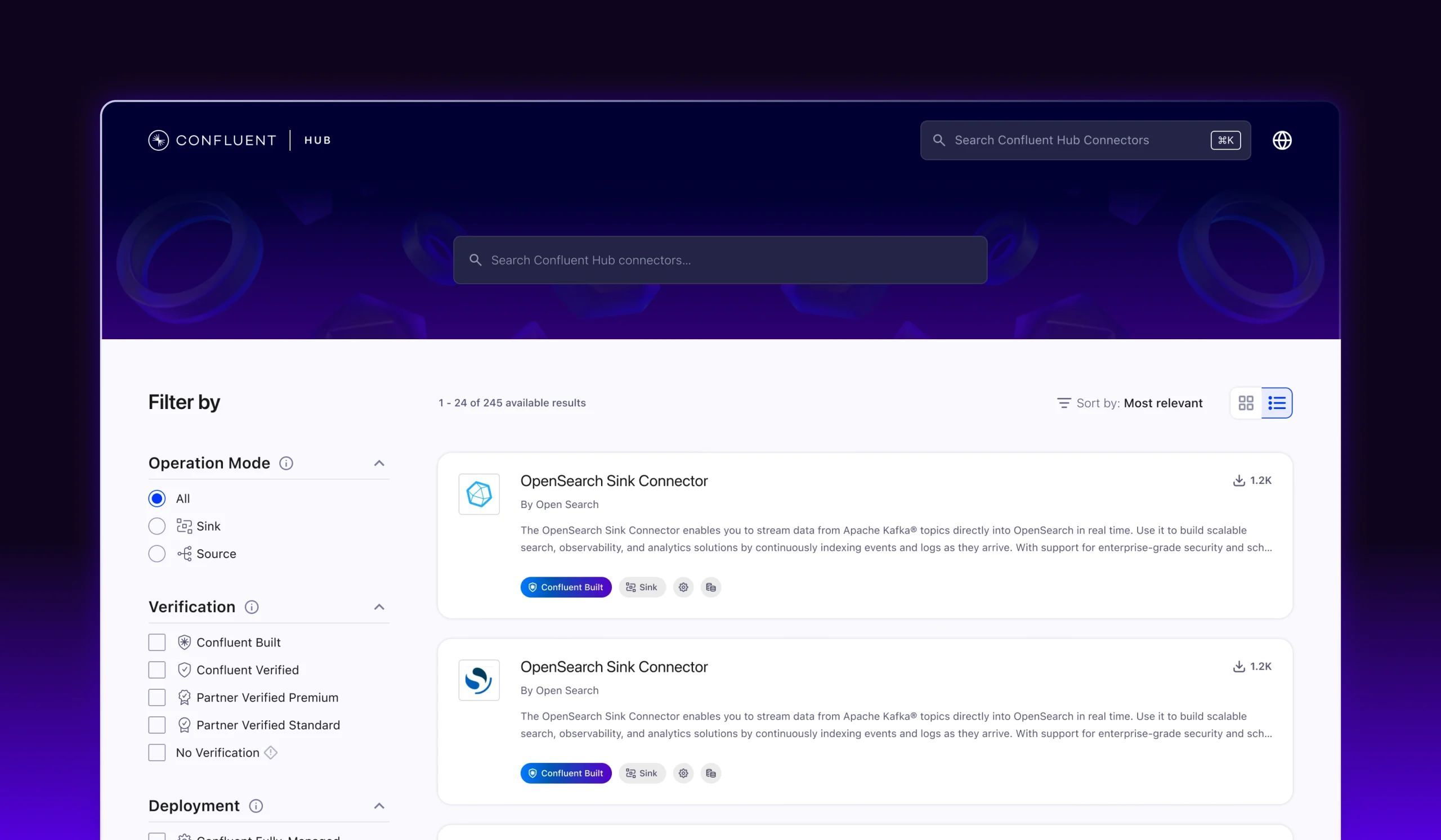
In the MVP, search and browsing were collapsed into a single experience. For the vision work, I separated them into a dedicated search page, giving goal-driven users the tools to find the right connector quickly while still supporting exploration.
I also introduced a persistent search bar at the top of the interface, accessible with keyboard shortcuts. This allowed developers to launch searches instantly from anywhere — a familiar pattern for builders used to command palettes.
Key improvements included:
- Refined search UI with clearer hierarchy and better handling of long results.
- Simplified filters, removing redundancy while keeping the most meaningful dimensions.
- Iconography has been added to filters, so that identifying metadata becomes easier in connector cards.
- Scannable metadata to make comparisons faster across large result sets.
- Card view vs. list view toggle, supporting both quick visual scanning and dense side-by-side evaluation.
This separation made the flow more purposeful: the landing page inspires, the search bar and results enable precision, and the connector detail page closes the evaluation loop.


EXTENDING HUB WITH A MARKETING LAYER
To extend Confluent Hub beyond a simple catalogue, I designed a dedicated marketing page that reframed it as an entry point into the broader Confluent ecosystem. Instead of focusing only on utility, this page highlights the value of connectors in practice and positions Hub as a trusted destination for both discovery and education.
Key elements included:
- Hero messaging that clearly states the role of connectors in powering modern data systems.
- Dynamic highlights like Newly Added and Most Downloaded to showcase both emerging and popular connectors.
- Curated use-case collections to help developers link technical components to real-world needs.
- Customer success stories and educational content that show how leading companies use Confluent connectors in production.
The marketing layer anchored Hub in a bigger narrative: not only guiding connector discovery, but also amplifying Confluent’s role in the broader data streaming ecosystem.


CONTACT ↴
©2026