


NOTHS & More
FOCUS
UX/UI
ROLE
SOLE DESIGNER
PLATFORM
WEB | NATIVE APPS
TIMELINE
JAN 2023—MAR 2023
NOTHS & More is a paid membership program designed to increase customer retention and frequency of purchase at Not On The High Street. The MVP laid the foundation for a broader membership strategy, starting with a simple 10% discount on every purchase for a year. The goal was to create a more rewarding experience that could evolve into a richer, more integrated offering across both web and app.
Framing the Problem
THE CHALLENGE
NOTHS wanted to introduce a membership scheme to improve retention and drive more purchases across both web and native app platforms. This meant encouraging new customers to adopt a more active shopping behaviour, while also rewarding our most loyal customers with meaningful benefits, but this came with competing priorities and risks.
Other considerations were:
- Adding membership couldn’t slow down or confuse the purchase flow.
- Users had to be able to discover membership with ease.
- Users needed clarity on what they’d actually gain from joining.
MY APPROACH
I focused on launching quickly while making sure the design could grow beyond the MVP. That meant exploring broadly at first, then narrowing the scope in close collaboration with developers to keep the initial release realistic.
Some tasks included:
- Considered all potential entry points for membership and prioritised the most impactful for launch.
- Researched loyalty models beyond adjacent marketplaces to spot transferable ideas and common patterns.
- Worked alongside developers to define what was feasible for MVP.
THE SOLUTION
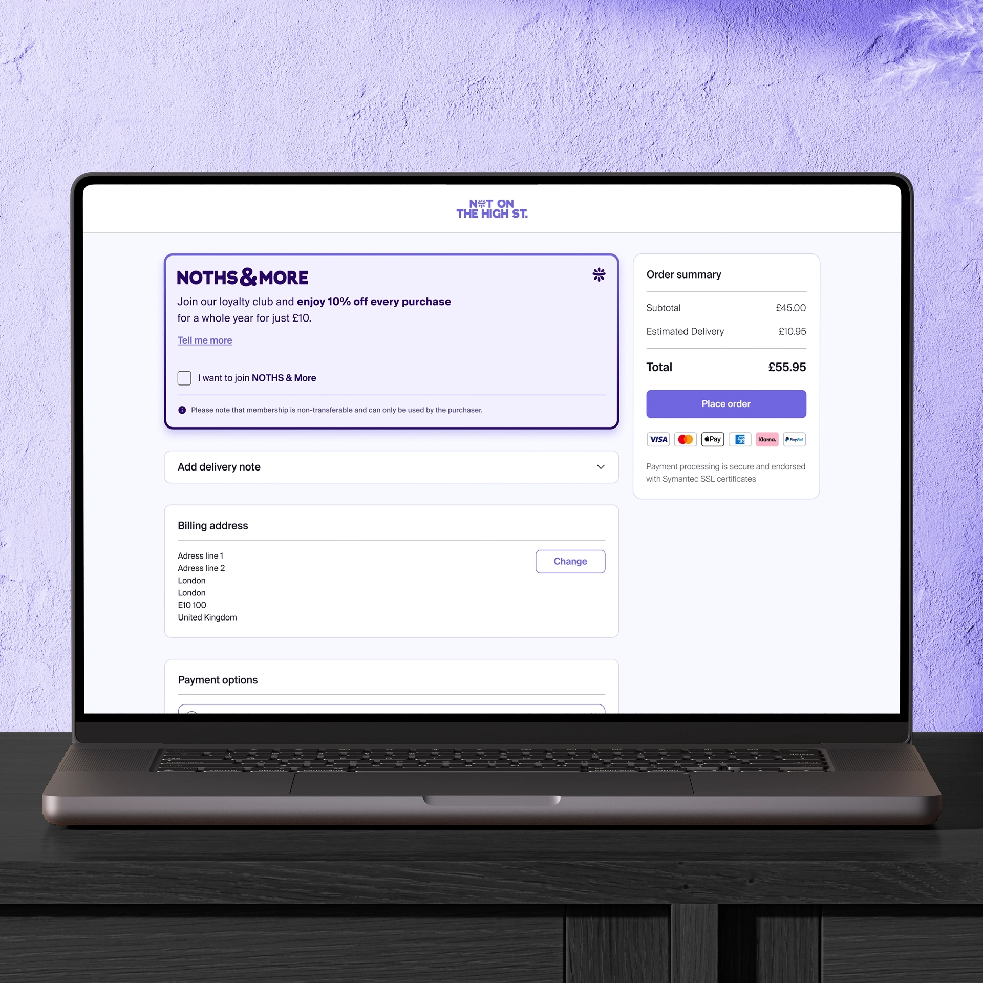
Due to technical constraints, the MVP could only impact one part of the user journey. We chose checkout as the most strategic point to introduce the membership callout, since users are already committed to purchase and more open to last-minute upsells. The membership was presented as a simple, low-friction add-on: a checkbox with clear language and immediate impact.
The initiative also included:
- Membership landing page: created a dedicated page to outline benefits and build trust.
- Transactional emails: updated post-purchase communications to reinforce awareness of the scheme.
- Success metrics: tracked adoption, repeat purchase behaviour, and engagement to guide future iterations.
More specifically, the metrics that we set to measure the success of NOTHS&More were:
Implementation
CHECKOUT AS THE KEY TOUCHPOINT
We considered several areas to promote membership. For the MVP, we focused on two: checkout and the homepage banner, which created broader awareness in the first months post-launch. Together, these touchpoints gave the program visibility at the entry point of the journey, with plans to expand to additional surfaces later.
- Homepage for visibility: The banner gave us the widest reach, making the program highly discoverable in the early months.
- Check out for conversion: Since users were already committed to buying, it was the most effective moment to drive sign-ups.

HOMEPAGE PROMOTION
We used the homepage banner — the most visible entry point — to advertise membership during the first months after launch. Clicking the banner took users directly to the dedicated Membership page, where the benefits were explained in detail. Once awareness was established, the banner returned to seasonal campaigns, while membership was moved to a secondary but still prominent section of the homepage.

A DEDICATED MEMBERSHIP PAGE
To support discoverability beyond checkout, we introduced a dedicated Membership page that clearly explained the program’s benefits and how it worked.
This page served multiple purposes:
- Educated users unfamiliar with the program.
- Highlighted the 10% discount and how it applied.
- Explained the one-time fee and 1-year duration.
- Provided activation guidance for guest users.
The page was accessible from the main navigation and promoted across key touchpoints like CRM campaigns and app surfaces, ensuring the scheme could be discovered even by users who hadn’t yet reached checkout.

ADDING A MEMBERSHIP MODULE
A new module was introduced at checkout to present the membership offer at the most strategic point in the journey. Once selected, the membership was added as a line item, and the 10% was applied instantly. The interaction was fully reversible; unchecking the box removed both the membership and the discount, giving users transparency and control.
This design ensured the offer was obvious without interrupting the flow:
- Clear placement within the checkout page.
- Real-time savings feedback reinforced the value.
- Simple opt-in/opt-out interaction built trust and encouraged adoption.
CHECKOUT WITH MEMBERSHIP MODULE UNCHECKED
CHECKOUT WITH MEMBERSHIP MODULE CHECKED

TRANSACTIONAL EMAILS
For account holders, membership was activated automatically. But for users who checked out as guests, creating an account was required for activation. So we designed a timely activation email that:
- Prompted account creation or sign-in.
- Explained that activation was required to access benefits.
- Reinforced value with a friendly tone and focused CTA.
EMAIL MOCK UP

ACTIVATION EMAIL FOR GUEST CHECKOUT USERS

EMAIL MOCK UP

MEMBERSHIP EMAIL FOR ACCOUNT HOLDERS

Outcome
ADOPTION AND IMPACT
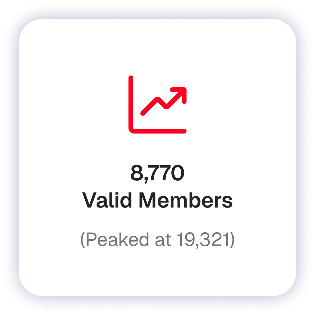
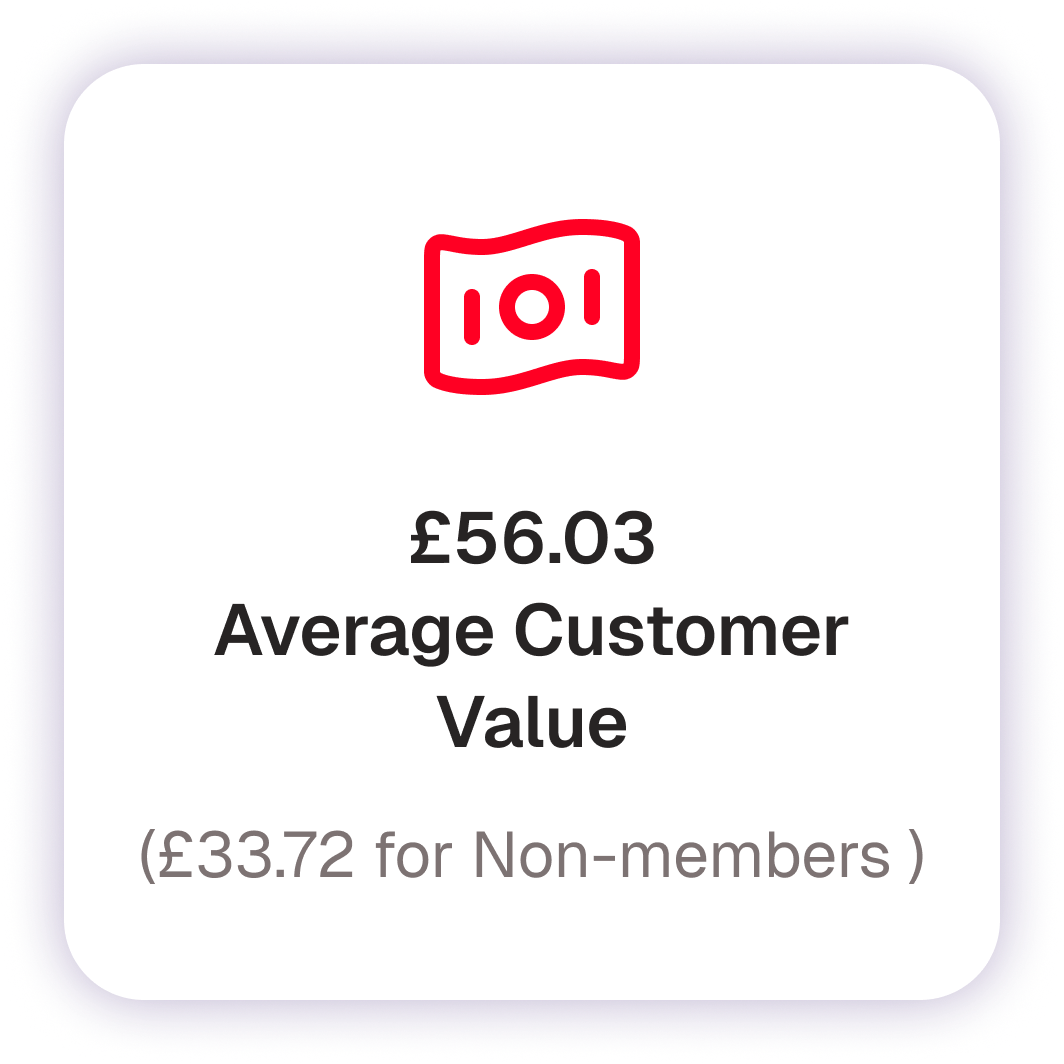
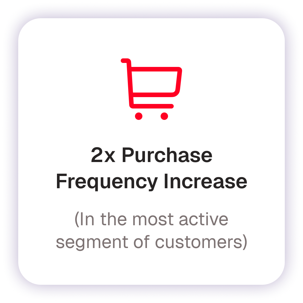
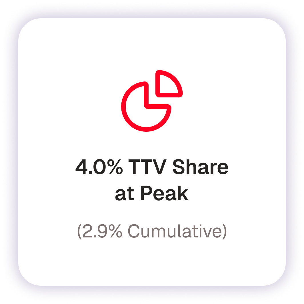
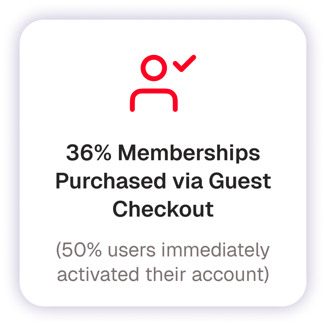
NOTHS & More launched on October 3, 2023, as a checkout-only MVP across Web and App. Within the first five months, it showed strong performance across all key metrics, with high adoption, solid activation rates, and increased purchasing behaviour among members. App membership share reached 21%, with guest checkout purchases accounting for 36% of sales.
By March 2024, the MVP had shown strong traction:

Vision and Future
EXPANDING MEMBERSHIP
The success of the MVP proved there was a real appetite for a loyalty-driven membership model. However, the initial implementation was limited to checkout. This made sense technically, but it left value on the table. The next step would have been to surface membership more broadly across the journey, making it feel like a core part of the NOTHS experience.
Potential expansion areas included:
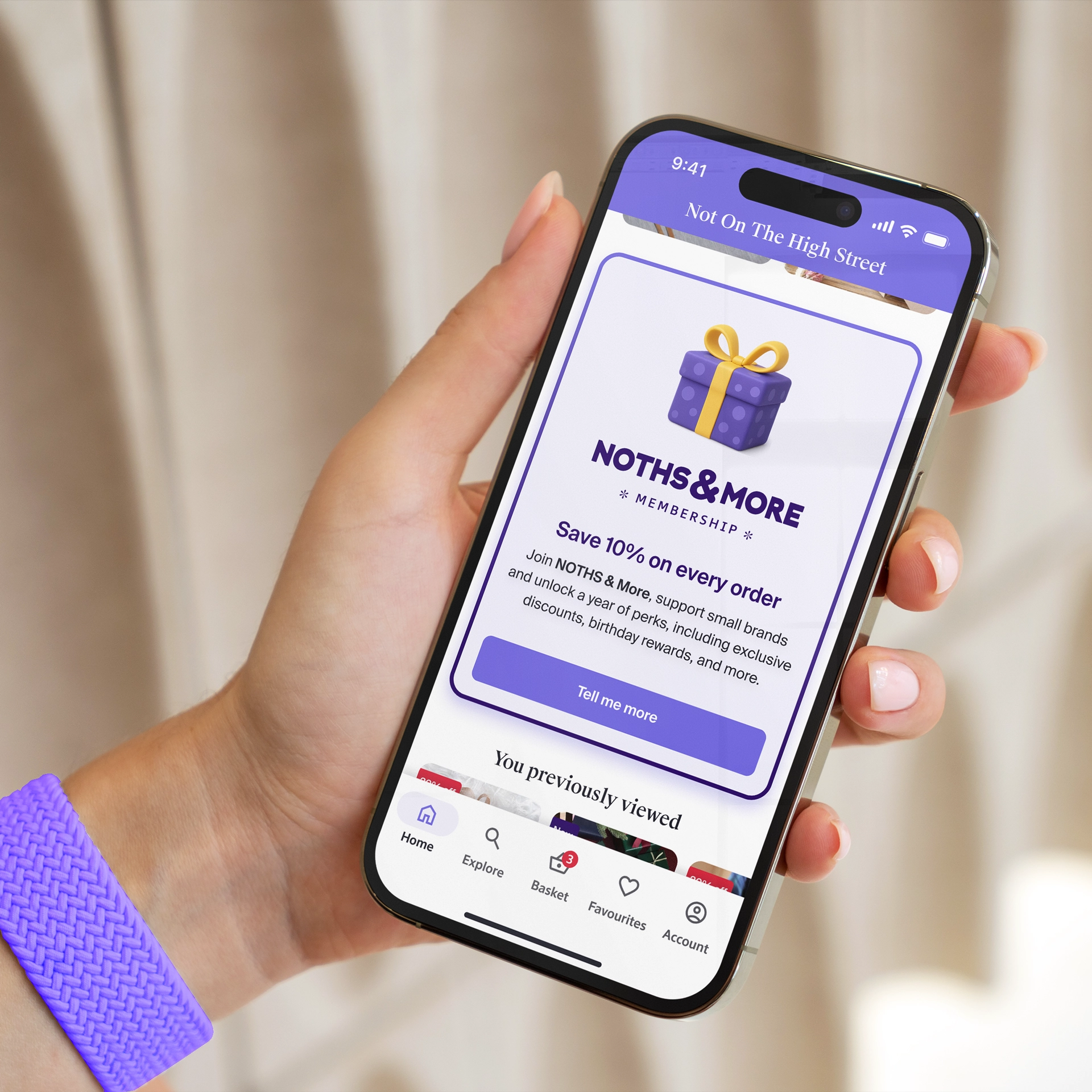
- Category & product pages: introducing membership earlier in the discovery flow.
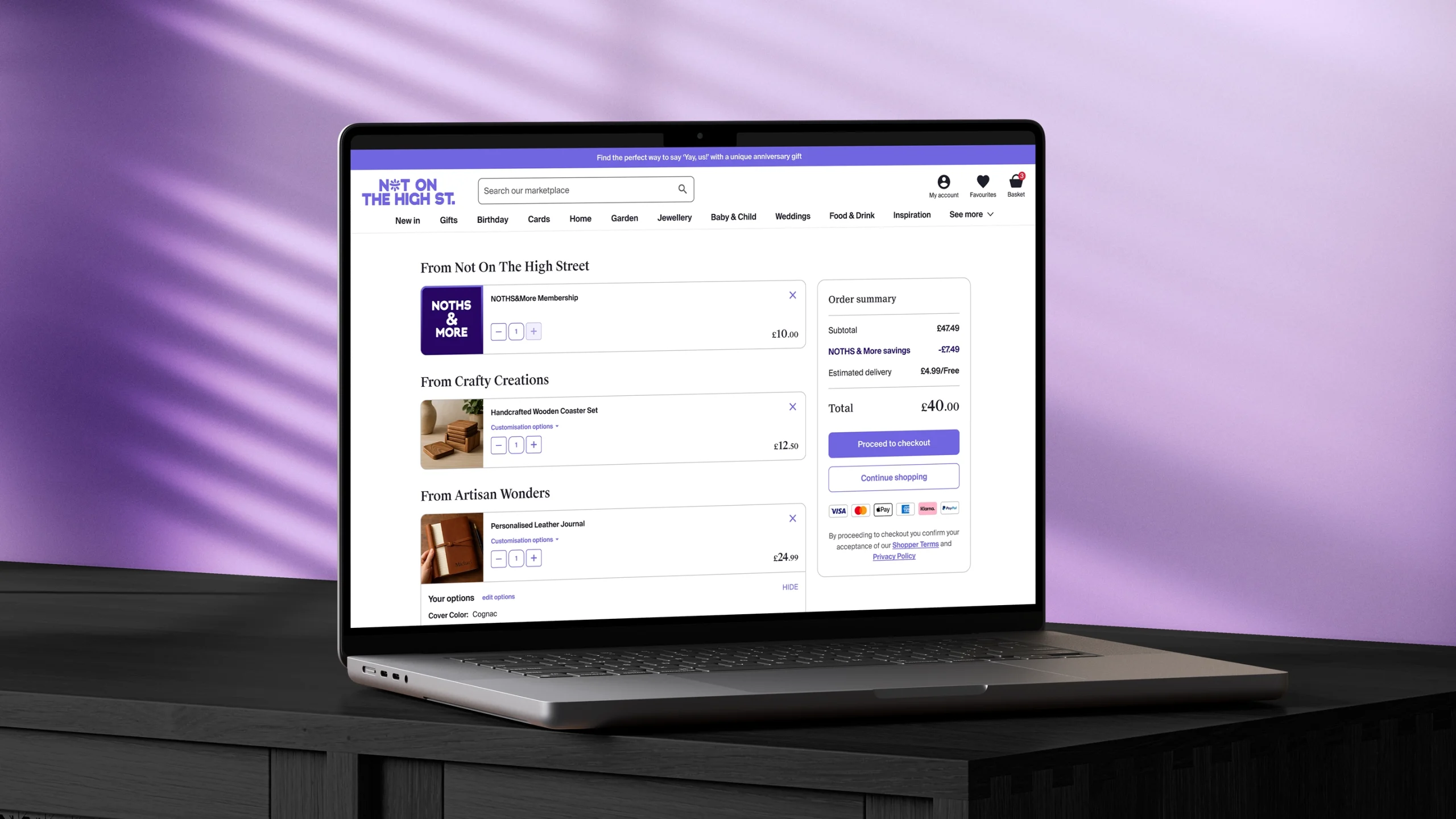
- Basket page: letting users add membership alongside items, reinforcing value before checkout.
- Account area: a dedicated Membership Hub for tracking benefits, perks, and renewal.
- Richier app experience: positioning the app as the best place to unlock full value.

MEMBERSHIP ADD-ON MODULE DISPLAYED IN THE BASKET PAGE

MEMBERSHIP ADDED TO BASKET WITH DISCOUNT APPLIED

MEMBERSHIP ADD-ON MODULE IN APP BASKET PAGE

MEMBERSHIP PROMOTION MODULE ON PRODUCT LISTING PAGE
BUILDING A RICHER APP EXPERIENCE
While membership could be promoted across both web and app, the NOTHS app was envisioned as the primary home for the program. Many marketplaces make their membership offering richer in the app to encourage adoption, and this was a key tactic here. The Membership Hub would give members a dedicated space to:
- Track savings and perks.
- View progress and renewal details.
- Access exclusive offers and content.
This initiative would position the app not just as another channel but as the primary home for membership, the best place to experience its full value. By creating a dedicated hub, the program could expand well beyond the initial proposals, opening space for new perks, richer features, and deeper ways to engage members, ultimately driving both app adoption and long-term loyalty.
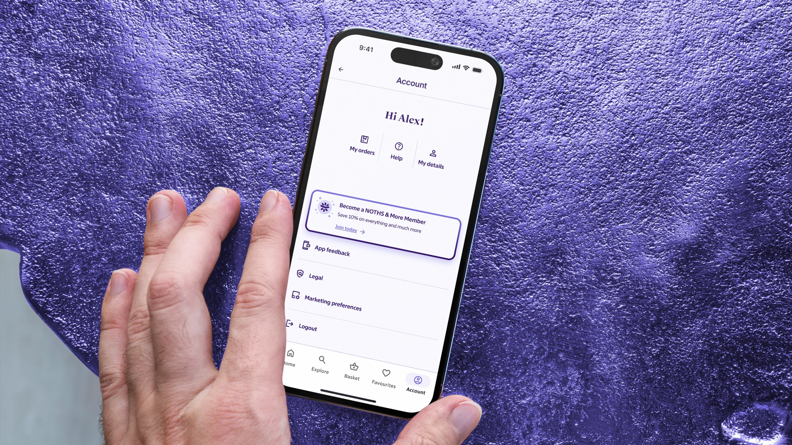
EVOLVING THE ACCOUNT EXPERIENCE
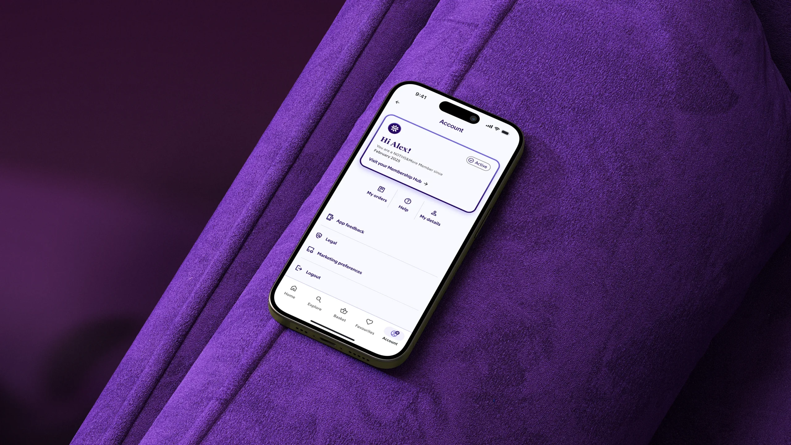
To support the introduction of membership, the account section needed more than a cosmetic refresh. It required a structural rethink. The goal was to move from a purely functional area, focused on orders and details, to a space that could actively showcase membership.
The redesign simplified the layout, gave more prominence to personalisation, and created a clear entry point for the new program. This set the stage for membership to live as a natural extension of the user’s account rather than an afterthought.
ACCOUNT SECTTION RE-DESIGN CONCEPT → CURRENT → IMPROVED → IDEAL

NON-MEMBER ACCOUNT → MEMBER ACCOUNT

NOTHS&MORE MEMBERSHIP HUB

CONTACT ↴
©2026